Instagram refreshes its iconic visual identity with a redesigned wordmark, marking the first update in a decade. Adam Mosseri weighs in.
Instagram Updates Wordmark After Decade, Signaling Brand Evolution
Instagram introduced a redesigned wordmark, updating its visual identity for the first time in about 10 years, according to platform reports.
Adam Mosseri, head of Instagram, was noted in reports concerning the update.
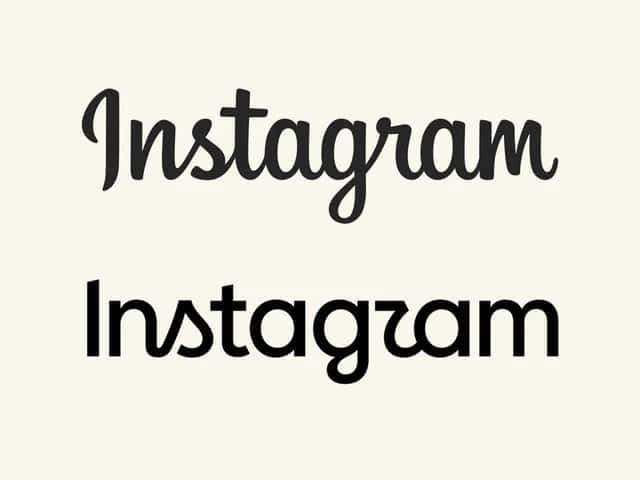
The new wordmark combines conventional typography with script-inspired curves, descriptions from the platform specified.
The multicoloured camera icon, Instagram's primary logo, remained unchanged, reports confirmed.
Instagram introduced a redesigned wordmark, updating a key element of its visual identity for the first time in approximately 10 years, platform reports indicated. The update applies to the text-based wordmark displayed at the top of the application, according to details from the company. The platform's familiar multicoloured camera icon remained unchanged, information stated. The redesign replaced the platform's familiar cursive lettering, reports specified. It features a hybrid style, combining more conventional typography with script-inspired curves, sources described. Elements of specific letters, including the "s," "r," and "g," retain a distinctive stylized treatment, according to the descriptions.
Brand Evolution and Digital Identity
For a platform like Instagram, visual identity acts as a critical touchpoint for its global audience. A wordmark update, even subtle, signals ongoing evolution to users and creators, in my analysis. It reflects a platform's commitment to maintaining relevance in a dynamic digital landscape. Such changes in branding often aim to resonate with current design sensibilities, attracting new demographics while reassuring existing users. My read is that this move reinforces Instagram's dedication to a contemporary user experience, crucial for user acquisition and sustained engagement. Many tech companies have refined their visual identities over time, aiming for clearer, more adaptable aesthetics across various digital interfaces. This trend suggests an industry-wide understanding of how brand perception influences user trust and platform stickiness. A modern wordmark can subtly communicate that a platform is forward-thinking and stable, important for brands and creators considering long-term engagement. The careful balance of modern elements with references to the original design highlights Instagram's strategy to evolve without losing its core identity, which is key for a brand with global recognition.
Market Context and Creator Impact
This wordmark refresh unfolds within a fiercely competitive social media market, in my opinion. Platforms like TikTok continuously push innovation in short-form video content and user engagement models. For Instagram, maintaining a contemporary brand image is vital for retaining its vast user base and attracting new creators. A "sharper and more modern" look can influence how creators perceive the platform's stability and future potential, according to marketing insights. This could encourage them to invest more in Instagram-native content, driving audience growth. The creator economy heavily relies on platforms that appear robust and innovative. A refreshed visual identity can communicate Instagram's ongoing commitment to its community, supporting content distribution and monetization efforts. Brands often evaluate platforms based on their perceived modernity and appeal to target audiences, my expertise indicates. This wordmark update could subtly enhance Instagram's attractiveness for advertising partnerships and brand collaborations. It positions the platform as a current and relevant player in the digital marketing ecosystem, essential for its commercial viability.
The wordmark redesign marks the first significant update to Instagram's textual branding in approximately 10 years, according to platform reports.
The Anatomy of a Rebrand Why Instagram Only Touched the Text
For the first time in a decade, Instagram has finally tweaked its wordmark. The familiar looping cursive is out, replaced by a hybrid font with stylized curves on the s, r, and g. While Instagram Head Adam Mosseri called the refresh sharper and more modern, a vocal chunk of the internet is already joking that the new logo reads like "Instagzam". But the actual story here isn't the typography. It’s what Meta didn’t touch.The vibrant, gradient camera icon, the exact same one that caused a massive uproar when it replaced the retro brown leather camera back in 2016, remains completely unchanged. There is a brilliant masterclass in brand equity buried in that decision. That gradient square sits on billions of home screens worldwide. It is the visual anchor that users tap entirely on muscle memory, often at a size where text is completely illegible. At Meta's scale, that level of instant, frictionless visual recognition is a priceless asset. Changing a text wordmark is cheap. It’s a lightweight way to update a brand's digital touchpoints and make the UI feel fresh, without asking the user base to relearn a core navigational habit. For any founder or operator watching this rollout, the takeaway is incredibly direct: fiercely protect the one visual signal your customers actually navigate by. Everything else is just decoration.
Future Implications for Engagement
My analysis suggests that consistent, subtle brand refreshes like this are strategic moves for mature digital platforms. They demonstrate an active posture in adapting to evolving user expectations and design trends. For Instagram, maintaining a fresh and modern appearance is not merely aesthetic; it is integral to its audience-and-growth framing. This signals to both users and advertisers that the platform is dynamic and responsive, rather than static. Such updates reinforce Instagram's position as a key player in the consumer and creator economy. They contribute to a perception of continuous improvement and relevance, which is critical for long-term user retention and attracting new talent. What strikes me here is how a small visual change can communicate a larger message about a company's commitment to its future. It impacts the brand's perceived reliability and innovative spirit, ultimately influencing how users and businesses choose to interact with the platform. Kanak Aggarwal, Contributing Author
Frequently asked questions
When did Instagram update its wordmark?
Instagram updated its wordmark for the first time in approximately 10 years, according to recent platform reports.
What is a wordmark?
A wordmark is a text-only logo that spells out the name of a company or product, utilizing a specific font, color, and style to represent the brand visually.
Did Instagram change its logo too?
No, the article states that while the wordmark has been updated, the core Instagram logo remains unchanged.
Who is Adam Mosseri?
Adam Mosseri is the head of Instagram, and he was noted in reports concerning the recent wordmark update.
What does the new Instagram wordmark look like?
The new wordmark combines conventional typography with script-inspired curves, aiming for a modern yet familiar aesthetic.
Why did Instagram update its wordmark?
The update signifies a brand evolution and a refresh of Instagram's visual identity, marking the first such change in about a decade.